

Why does the carpet you fell in love with at the showroom so often look like a total stranger once it's laid in your lounge? It's a common heartbreaker for homeowners in Rayleigh and across Essex. You spend weeks planning a renovation, only to find the "perfect" shade makes your space feel cramped or shows every speck of dust immediately. Understanding the most frequent mistakes to avoid when choosing carpet colour is the difference between a room that feels professionally designed and one that feels like an expensive error.
We understand that selecting a floor covering is a significant investment, and you want a result that stays looking fresh for years. We've seen how the shift towards 2026's warmer tones, like soft sage and earthy beiges, requires a different approach than the cool greys of the past. This article reveals how to master lighting, texture, and even subfloor preparation to ensure your choice works in your unique home. You'll discover how to pick a shade that balances aesthetics with practical durability, giving you a home you're truly proud to show off.
Key Takeaways
- Learn why the orientation of your room dictates the true appearance of your carpet and how to account for Light Reflectance Value (LRV).
- Understand how pile direction and texture create shadows that can make your chosen shade appear significantly darker once installed.
- Discover the common mistakes to avoid when choosing carpet colour to prevent making smaller rooms feel claustrophobic or dark.
- Find out why mid-toned shades are often more durable and easier to maintain for busy Essex households than very light or very dark options.
- See why viewing physical samples in your own home's lighting is essential to bypass the inaccuracies of digital screens and showroom lights.
Mistake 1: Ignoring the Impact of Natural Light and Room Orientation
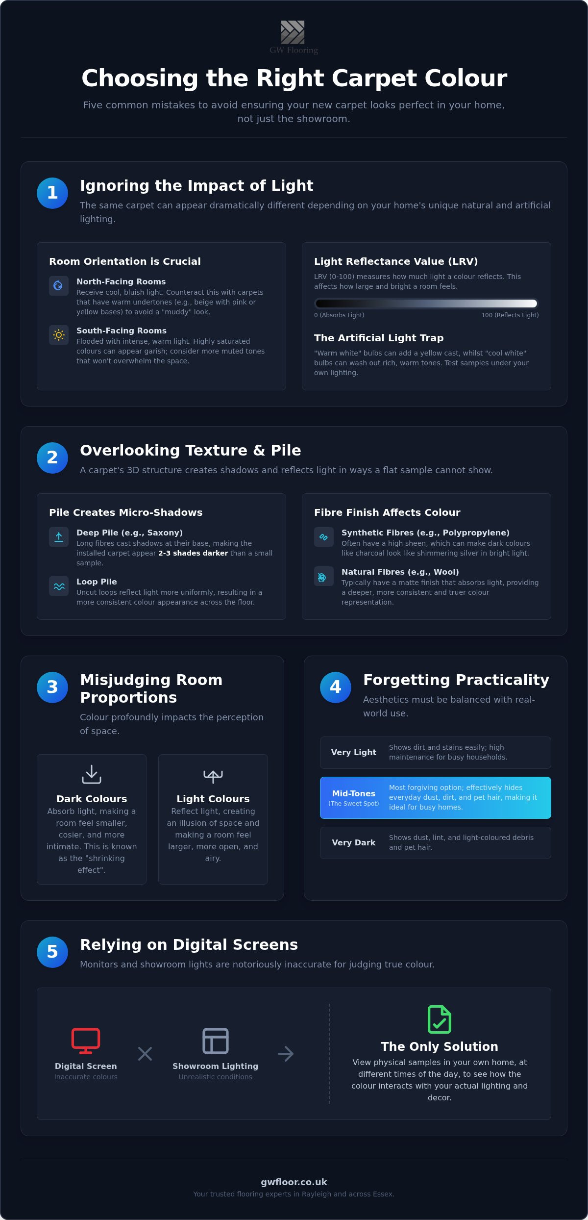
The lighting in a high-street shop is designed to sell products, not to mimic the reality of your living room. One of the most frequent mistakes to avoid when choosing carpet colour is assuming that a swatch will look the same under high-intensity showroom lights as it does in your home. We've often visited clients in Rayleigh who chose a warm beige in-store, only to find it looks cold and clinical once laid in their lounge. This happens because of Light Reflectance Value (LRV). LRV is a scale from 0 to 100 that measures how much light a colour reflects. A carpet with a low LRV will "eat" the light, making a dim room feel even smaller, whilst a high LRV can make a bright room feel overwhelming. By understanding color theory, you can predict how these values interact with your specific environment.
North-Facing vs South-Facing Room Dilemmas
North-facing rooms are notoriously difficult to carpet. They receive a consistent, cool, bluish light that can make even the trendiest greys look "muddy" or damp. If you're carpeting a north-facing bedroom, avoid cool undertones at all costs. Instead, look for carpets with warm pink or yellow bases to counteract the shadows and bring life to the space. South-facing rooms are the opposite; they are flooded with warm, intense sun. Whilst this is usually a benefit, it can make highly saturated colours look garish or neon. We always suggest viewing your samples at 10 am and again at 8 pm. This allows you to see how the "golden hour" in Essex affects the red and orange undertones in the yarn before you commit your budget.
The Artificial Light Trap
Your choice of lightbulb is just as important as the sun. Modern LED bulbs come in various "temperatures" that can completely shift the look of your floor. A "warm white" bulb can turn a crisp cream carpet into a sickly yellow overnight. Conversely, "cool white" or daylight bulbs can strip the life out of a rich brown or taupe. Because we bring our mobile showroom directly to you, we can test samples against your specific halogen or LED setup. This step is vital to ensure the final result matches your vision. It prevents the disappointment of a floor that looks beautiful by day but completely changes character once the lamps are switched on. We pride ourselves on this meticulous approach, ensuring that the "invisible" factors like lighting are managed just as carefully as the installation itself.
Mistake 2: Overlooking How Texture and Pile Direction Alter Visual Colour
Choosing a colour based solely on a flat swatch is one of the biggest mistakes to avoid when choosing carpet colour because it ignores the physical structure of the yarn. A carpet isn't a flat piece of paper; it's a three-dimensional forest of fibres. Deep-pile Saxony carpets are a prime example of this. Because the pile is so long, the base of the yarn is almost always in shadow. This creates a "shadow effect" where the installed carpet appears two or three shades darker than the small, brightly lit sample you saw in the shop.
The way light interacts with the weave also dictates the vibrancy of the shade. Loop pile carpets tend to reflect light more uniformly, whilst cut pile carpets absorb it, creating a richer but more variable appearance. For those seeking a consistent look, following practical guidance from the Carpet and Rug Institute can help you understand how different constructions behave under foot. Pile height creates micro-shadows that deepen colour across the entire floor surface.
Consistency also depends on what lies beneath. If your subfloor is uneven, the carpet will follow those contours, leading to "pooling" or "shading". These are areas where the pile leans in different directions, creating dark and light patches that look like water stains. We believe the finish is only as good as the foundation, which is why we prioritise meticulous subfloor preparation to ensure your chosen colour looks uniform and professional across the whole room.
The Sheen Factor in Synthetic Fibres
Many modern carpets are made from synthetic fibres like polypropylene, which naturally possess a high sheen. In a bright, sun-drenched room, this reflective quality can drastically alter your colour choice. A charcoal grey might suddenly look like a shimmering silver, which may not be the aesthetic you intended. In contrast, wool has a matte finish that holds colour with more depth and less reflection. It's worth comparing a synthetic sample against a wool one in your own home to see which finish suits your style better.
Pile Direction and "Tracking"
Certain textures, particularly velvets and deep plushes, are prone to "tracking". This is where footprints and vacuum marks stay visible, essentially changing the colour of the carpet in those spots by altering the angle of the pile. In high-traffic Essex hallways, this can make a floor look messy even when it's clean. Ignoring how movement affects the yarn is amongst the common mistakes to avoid when choosing carpet colour in busy households. Choosing mid-toned colours or flecked "heather" textures can help disguise these tracking marks, keeping your home looking pristine between deep cleans.
Mistake 3: Misjudging Room Proportions and the "Shrinking Room" Effect
The floor is the second largest surface area in any home, so it has a massive impact on the visual volume of a room. One of the most common mistakes to avoid when choosing carpet colour is failing to account for how a shade alters the perceived dimensions of a space. Dark, heavy colours have a high visual weight. They tend to advance towards the eye. In a cosy Rayleigh cottage with lower ceilings, a charcoal or deep navy carpet can make the walls feel like they are closing in. This creates a claustrophobic atmosphere that no amount of clever lighting can fully fix.
To combat this, we often suggest using cool-toned carpets like soft blues, pale greens, or light greys. According to principles of Color Theory in Interior Design, cool colours are "receding" colours. They trick the brain into thinking the floor surface is further away than it actually is, which effectively "pushes back" the walls. Another detail we often see overlooked is the relationship between the carpet and the skirting boards. If you choose a dark carpet against high, bright white skirting, you create a harsh horizontal line that visually chops the floor. This makes the room look significantly smaller than if you had chosen a mid-tone that blends more softly with the woodwork.
Small Hallways and Landings
Narrow Essex terrace hallways require a strategic approach to maintain a sense of space. We recommend light-to-mid tones for these areas to keep them feeling airy and welcoming. A major error we encounter is the "patchwork" effect, where homeowners choose different colours for every single room. This breaks the visual flow and makes a house feel like a series of small boxes. By working with Professional Carpet Fitters in Essex, you can ensure seamless transitions between rooms. Using a consistent colour palette across landings and connecting spaces unifies the home and creates an illusion of much greater square footage.
Large Open-Plan Spaces
In larger, modern Rayleigh builds, the challenge is often the opposite. A vast expanse of very light carpet can look "washed out" and leave the room feeling echoing and cold. In these scenarios, we use deeper, warmer tones to ground the space. These richer colours provide a foundation for your furniture, preventing your sofa and tables from appearing to "float" in a monochrome box. The key is balance. If your walls are a neutral off-white, a mid-to-deep taupe or warm stone carpet provides the necessary contrast to make a large room feel grounded and intentional rather than empty. This is amongst the most frequent mistakes to avoid when choosing carpet colour in large-scale renovations.
Mistake 4: Forgetting the Practicalities of Your Essex Lifestyle
Your home should be a place of relaxation, not a source of constant cleaning anxiety. One of the most overlooked mistakes to avoid when choosing carpet colour is failing to account for the specific "traffic profile" of your household. In Rayleigh and the surrounding Essex countryside, we often deal with clay-heavy soil that can be unforgiving on certain shades. Whilst a pure white or cream carpet looks stunning in a showroom, it's often an impractical choice for homes with muddy paws or active toddlers. The goal is to find a balance where your floor looks beautiful but doesn't require a professional deep clean every month.
Surprisingly, going to the opposite end of the spectrum is also a trap. Very dark carpets, such as deep navy, black, or dark chocolate, are notorious for showing every single speck of light-coloured debris. Lint, pet dander, and even small crumbs stand out vividly against a dark background. This means a black carpet can actually look "dirtier" faster than a mid-grey or taupe. We've spent 20 years helping local families navigate these choices, ensuring the "invisible" daily wear doesn't ruin your investment. If you're struggling to find the right balance for your home, you can view our full range of durable carpets through our mobile showroom service.
The "Flecked" Advantage
Heathered or flecked carpets are a secret weapon for busy Essex households. These designs use multi-tonal fibres, blending three or four similar shades into a single yarn. This creates a visual "mask" that hides small bits of lint, hair, and dry soil between vacuuming sessions. Greiges, warm taupes, and "peppered" greys are amongst the most forgiving colour families. They provide a sophisticated, modern look whilst being incredibly forgiving of the occasional dropped crumb or dusty footprint. It's a practical way to maintain a high-end aesthetic without becoming a slave to your vacuum cleaner.
Fading and UV Protection
Another lifestyle factor often ignored is the impact of the sun. If you're carpeting a conservatory or a room with large south-facing windows, UV exposure will eventually bleach the pigment out of your floor. This is a common mistake to avoid when choosing carpet colour for modern, glass-heavy extensions. Deep reds and vibrant blues tend to fade the fastest, often leaving unsightly "shadows" where furniture has protected parts of the pile. For these high-sun areas, we recommend solution-dyed synthetics. Because the colour is added during the liquid stage of fibre production rather than being dyed on the surface, these carpets hold their vibrancy far longer. Choosing a lighter, neutral shade can also help make any eventual fading much less noticeable over time.
Mistake 5: Relying on Digital Screens Instead of In-Home Samples
In an era where we can order almost anything with a tap of a finger, it's tempting to pick your new flooring from a website gallery. However, relying on a laptop or smartphone is amongst the most dangerous mistakes to avoid when choosing carpet colour. Digital screens use RGB pixels and often have "blue light" filters or "night shift" modes active, which fundamentally distort how a colour is displayed. A "warm clay" on your iPhone might arrive as a "cold flint" in reality. Digital visualisers cannot replicate how light catches a specific pile height or how the texture creates micro-shadows that deepen the shade.
Relying on a digital visualiser is a significant gamble. These tools often include small print admitting that colours vary, yet many homeowners still bypass physical samples. When you see a large sample on your own floor, you can observe how the colour "behaves" as the sun moves across the room. A shade that looks vibrant at midday might feel too somber by dusk. This level of detail is impossible to capture through a screen, which is why we always insist on a physical, in-home assessment before any order is finalised.
The "Showroom to You" Advantage
The Importance of Underlay and Subfloors
The aesthetic perfection of your carpet depends heavily on the "invisible work" beneath it. A poor-quality or uneven subfloor creates subtle "valleys" across the room. These dips alter how light reflects off the carpet surface, often resulting in dark patches that can be mistaken for stains or manufacturing defects. We treat every project with the discipline of a master craftsman, prioritising meticulous Subfloor Preparation before a single inch of carpet is laid. Subfloor screeding is the essential foundation for aesthetic perfection. By ensuring a perfectly level base and using a high-quality underlay, we provide the consistent "bounce" and surface tension required for your chosen colour to look uniform and professional from every angle. A premium underlay also ensures the pile stays upright, preventing the premature crushing that makes colours look dull and faded over time.
Secure Your Perfect Home Transformation
Choosing the right shade involves more than just liking a swatch; it requires a careful look at how natural light interacts with the pile and how your specific lifestyle demands durability. By remembering the mistakes to avoid when choosing carpet colour, such as relying on digital screens or ignoring room orientation, you can ensure your investment brings long-term pride and comfort to your household. Every detail matters, from the initial subfloor preparation to the way a specific texture catches the afternoon sun in your lounge.
We are a family-run Rayleigh business with over 20 years of expert installation experience. We take genuine pride in helping our neighbours find the perfect fit, whether that is a plush luxury carpet or premium flooring from brands like Amtico and Karndean. We believe the process should be entirely frictionless, which is why we bring the expertise and the samples directly to your doorstep for a real-world test.
Book your free "Showroom to You" home visit in Essex today and take the first step toward a beautiful, professionally validated interior. We look forward to helping you realise a vision for your living space that stays looking new for years to come.
Frequently Asked Questions
Why does my carpet look a different colour than the sample I saw in the shop?
Your carpet looks different because of metamerism, which is how different light sources change your perception of pigment. Showrooms often use high-intensity fluorescent tubes that lack the warm or cool spectrum found in your home's natural light. To avoid one of the most frustrating mistakes to avoid when choosing carpet colour, you must view samples in the specific room they are intended for. This ensures the Light Reflectance Value (LRV) works with your existing lamps and windows.
What is the best carpet colour for hiding pet hair and dirt?
Mid-toned heathered carpets are the most effective at disguising daily wear from pets and busy households. These multi-tonal fibres blend several similar shades together, which helps to mask lint, dry soil, and pet dander between vacuuming sessions. We generally recommend warm taupes, "peppered" greys, or sandy beiges for Essex homes. These shades are far more forgiving than pure whites or very dark charcoals, which tend to highlight every speck of debris.
Can a carpet colour make a small room look bigger?
Light, cool-toned carpets like pale grey, soft blue, or off-white can make a small room feel significantly more spacious. These are known as "receding" colours because they trick the eye into thinking the floor surface is further away. If you combine a light carpet with matching light-coloured skirting boards, you remove the harsh horizontal lines that often "chop up" a room. This creates a seamless visual flow that opens up even the tightest Rayleigh cottage rooms.
Do dark carpets make a room feel colder or warmer?
Darker carpets generally make a room feel warmer and more intimate because they absorb more light and heat. Visually, deep tones like chocolate, forest green, or navy provide a "grounded" feeling that works beautifully in large, echoing spaces. This makes them a popular choice for bedrooms or formal dining rooms where a cosy, snug atmosphere is the priority. However, they require careful balancing with lighter walls to prevent the space from feeling too heavy.
How do I know if a carpet colour will fade in my sunny conservatory?
A carpet's fade resistance is determined by its dye method; look for solution-dyed synthetic fibres for high-sun areas. Solution-dyed yarns have the pigment added whilst the material is still in a liquid state, making the colour part of the fibre itself. This is much more durable than traditional "piece-dyed" carpets where the colour is only on the surface. We always suggest avoiding vibrant reds or deep purples in conservatories, as these pigments break down fastest under UV exposure.
Should the carpet be lighter or darker than the walls?
Choosing a carpet that is two shades darker than your walls creates a balanced, grounded aesthetic that most people find comfortable. This "bottom-heavy" approach mimics the natural world and makes furniture feel more stable in the room. However, if you're aiming for a modern, airy feel, choosing a carpet that is slightly lighter than your walls can lift the space. The key is to ensure there is enough contrast so the room doesn't look like a flat, monochrome box.
Will a grey carpet go out of style by 2027?
Cool, clinical greys are gradually being replaced by "greiges" and earthy, warm neutrals as we move towards 2027. Whilst grey remains a versatile choice, the current trend is shifting towards soft sage, terracotta, and sandy taupes. Understanding these shifts helps you navigate mistakes to avoid when choosing carpet colour for long-term style. If you love grey, choose a version with warm yellow or red undertones to ensure it stays relevant as interior fashions evolve over the coming years.
How do I test a carpet sample properly at home?
To test a sample properly, place it flat on the floor in the corner of the room where it will be installed. Never look at a sample whilst holding it upright or placing it on a table, as the pile reflects light differently when horizontal. Leave the sample in place for at least 24 hours so you can see how it looks under morning sun, afternoon shadows, and your evening artificial lighting. This simple test prevents expensive errors and ensures you're happy with the shade at all times.


